Role: Design enticing postcards and brochure to captivate target audience along with communication with various print vendors to get the desired end product. Another aspect of my job that I will show an example of is social media content creation.  

One of my primary roles at NAFCU is to design various print related collateral to promote our various conferences. Below are a few of my projects which include postcards and a brochure.. The postcards were created for three different conferences. The three design components that I used to create the postcards include: color (to help place emphasis on key information that I wanted the viewers eyes to instantly gravitate towards), scouting appropriate imagery, and implementation of a clean typographical hierarchy to break up the content in the best way possible. 

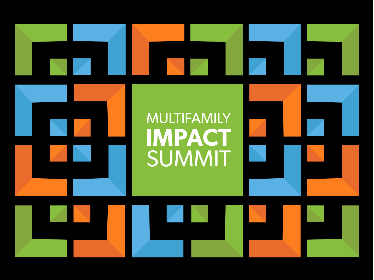
The brochure was created for one of our biggest and most prestigious conferences. I utilized the designated conference colors/patterns, implemented a clean yet dynamic typographical layout, and placed imagery to break apart all the copy. 

The first social post I created was for Juneteenth! This was meant to be a simple graphic that placed emphasis on the holiday colors and the organizations support for it. My design was used across the organizations various social media platforms. The second social media post was designed to advertise and amp up the cover for one of the organizations famous editorial pieces called the Roadmap. My job was to create a nice graphic that could be used for the cover of the book. I illustrated a simple road that leads the eye to the call to action. This design was created in a way that could be used for both digital and print usage. In this case, it was advertised on the organizations Instagram story. 

Brochure: Front Cover 

Brochure: First Panel and Inside Flap

Brochure: Three Inside Panels 

Brochure: Back Cover

Juneteenth Instagram Post

Roadmap Instagram Story

You may also like

Back to Top